It all starts in the month of March…
I started recording my data on weather, what I am eating, and how much time I am spending outdoors.
Actually, this past year I had already started recording what I had been eating since January 1st as part of my New Years resolution. I around April I noticed that I had started to lose weight… I was really confused how that was possible as I was not more active than before quarantine. I figured that I must have been losing weight because I was eating less in general. Perhaps it was because I was cooking more and ordering less, resulting in smaller portions. By the end of this exploration I started to realize that I was intermittent fasting on accident: I would eat my meals within a 8 hour window each day, resulting in a daily 16 hour mini fast!
Lets take a look at my process:

Xander and I made a day in our lives. Xander slept from 3 am to 10 am (black) relaxed at 11 (blue) went to class (green) then ate (orange) and finally worked (yellow). This breakdown of a day showed a limited and finite amount of time in a day (24 blocks).

Then we looked at a week! Blue blob is sleep, orange blob is work, yellow blob is play! Work hard, play hard am I right!
Our teacher came over and challenged us to actually work with the materials:

If you don’t have enough sleep, your day will fall over!


Okay, these photos look a little squashed on my screen but here is my recorded data!
Lots of interesting things going on but essentially I attempted to distill the information down into an understanding of calories burnt and calories consumed.


Working with the same three points of data, I tried to visualize the week in a few different ways. I wish I had been more explorative at this stage but it’s too late now!


I looked at different ways to show days, or months, or years. (I wish I had time to do a year, it would look really fun i think.)
To be honest… I have never used this much color in my life. All of my design work has been black and white or monochromatic. I took a lot of time to pin down the right colors but in the end I think I got lucky.

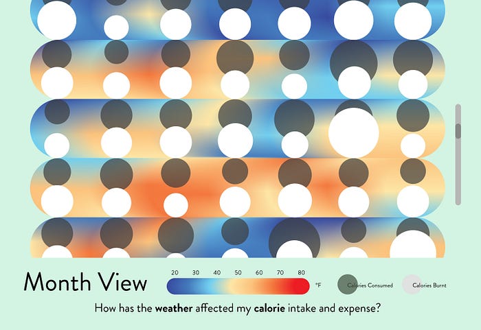
I started off simply trying to show weather and how that would be the background or shape of my data.


I tried out playing with the colors of each day. Looks here like on colder days I eat more.


Oh no! Kind of looks like eyeballs!


Perhaps a blended view is more enticing. It might allow the weather data to stand separate from the calorie data!


A few more fun ones before my final!


I attempted a colored background that would show the current temperature of at the time of viewing the dashboard.


I also attempted a weekly view of the project where one might see the exact times of day that I do stuff! Turns out that I am pretty much doing nothing for most of the week (most of the day even) except for mornings and weekends!

A potential final view!
I’m imagining a scrolling view of the months/weeks! Hovering would reveal what day!
